The 8 Different Types of Football Fan

BuzzFeed has had phenomenal success over the past year – so I thought I’d jump aboard the bandwagon and use its community feature to write my own guest post.

I’ve reproduced the article below but, to see it on BuzzFeed itself, click this link: .

1. The Know-it-all

Much more comfortable in his armchair than at an actual game, The Know-it-all is usually surrounded by a couple of doting minions who’ll lap up his every knowledgeable comment. The Know-it-all is surprised by nothing and will disdain those who get excited by anything happening on the pitch.

The 8 Different Types Of Football Fan
  / Via Time Out London

Smugness has no place in football

2. The Corporate Fan

The Corporate Fan might attend only the big midweek games when he can get a freebie from a business partner, but that won’t put him off venturing his opinions on everything from Diego Simeone’s tactical acumen to Frank Lampard’s waistline.

  / Via Getty

You won’t see him on a February night at Boundary Park

3. The Thug

A football match is simply an excuse for The Thug to vent his anger at the mediocrity of his everyday existence. While The Thug will pretend his vein-bursting, foul-mouthed rants at opposing fans are in support of his team, what he really wants is an old-fashioned brawl.

The 8 Different Types Of Football Fan
  / Via giphy.com

Keep your distance

4. The Theatre-goer

The Theatre-goer will sit in silence, occasionally shaking his head when his team lets him down yet again. He doesn’t cheer or even celebrate after goals – the only sign he can speak is when someone in front of him stands up, when he’ll immediately shout at them to sit down.

  / Via Getty

What do you actually enjoy about football?

5. The Ego

The Ego sees a football match as an opportunity to impress a large number of people with his puerile sense of humour and juvenile japes. Similarly to The Know-it-all, The Ego will expect appreciation from all others around him.

The 8 Different Types Of Football Fan
  / Via Eat Watch Run

We’d rather watch the game

6. The Emo

The Emo took Bill Shankly’s famous saying to heart: nothing matters more than in which net the pig’s bladder ends up on a Saturday afternoon. Even the birth of his children won’t prevent The Emo from missing a game.

  / Via Getty

Football: more important than life and death

7. The Old Timer

The Old Timer is a pleasant old man who makes a point of shaking everyone’s hand before a game. He hasn’t missed a game since 1963 and wants his ashes scattered in the stadium when he dies.

The 8 Different Types Of Football Fan
  / Via Who Ate All The Pies

The Old Timer could teach Luis Suárez a thing or two

8. The Singer

A dying breed within modern football, The Singer spends every Saturday night massaging his vocal chords after their intense workout. He considers missing the warm-up a mortal sin and will abuse anyone who leaves the game before the final whistle.

  / Via Getty

On your own

Data: How will England perform in the World Cup this summer?

Is there a correlation between clubs’ Champions’ League performances and their nations’ F.I.F.A. rankings?

Long has the debate raged about whether the strength of England’s domestic league harms the national team’s performance or, conversely, whether German clubs’ recent renaissance has been caused in part by the resurgence of the German national team.

Yet few attempts have been made to examine this link statistically. In this post, I will look into whether there is a correlation between the performances of a nation’s clubs in international competition and the performances of a nation itself, in the form of its F.I.F.A. ranking, to see whether this season’s Champions’ League can give us a clue to the outcome of the summer’s World Cup.

To read more of this story, visit this post on my Tumblr account (used because Tumblr can host interactive graphics, whereas my version of WordPress cannot). 

A blindfold and four pints: Tom Bayley plays guess the ale

Work experience in Trinity Mirror’s data unit

Earlier this month, I spent a week working under David Ottewell in Trinity Mirror’s data unit.

The data unit, formed only last year, comes up with various data-based article ideas for the different Trinity Mirror regional titles, which it presents in an internal bulletin. The regional titles then choose to use the findings as and when they wish.

I was given several interesting projects throughout the week, the most important of which was my research into MPs’ expenses. (The data on expenses can be found here.)

This led to a story on Wales Online:

I also did some research into how consistent each Premier League manager’s team selections have been this year. (The idea for the article came from someone at Wales Online, who had an inkling that Ole Gunnar Solskjær’s lack of success so far as Cardiff City manager might have been caused by his frequent tinkering with team selections.)

There was significant interest in this research from different Trinity Mirror titles. First, it appeared in the Manchester Evening News, but it also appeared on Wales Online and it even featured on the Mirror’s national site.

Some of the work performed by the data unit is long-term preparation: for instance, I helped to compile a spreadsheet of national teams’ World Cup records, ahead of the FIFA World Cup in June.

Much of the work, however, came simply from the day-to-day inspiration of the team members. For instance, David Dubas-Fisher had the idea of comparing the levels of support of football teams in the Championship this season; David Ottewell then suggested that we expand this research to a comparison of away support and home support (as teams’ home support can be influenced by various factors like ticket prices and the clubs’ catchment areas).

The result was that Burnley came out on top, to the delight of celebrity fan Alastair Campbell, whose retweet of the research led to much debate of our findings:

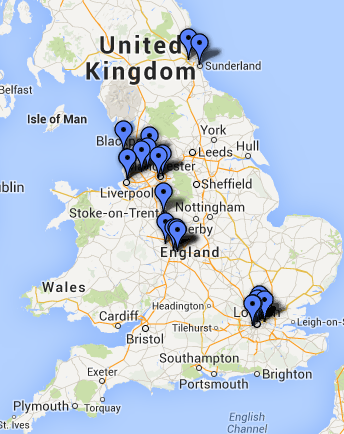
My final piece of work during this enjoyable week was to produce interactive maps of dentists listed on the NHS website as currently accepting new adult patients. I created these for different Trinity Mirror regions, as we thought they would be of use to readers. One of the maps, of Liverpool’s available dentists, is below*.

Liverpool NHS dentists

Note: click on the map to be taken to an interactive version.

*If you wish to see the other maps – for Birmingham, Coventry, Newcastle and Middlesbrough – let me know by commenting at the bottom of this article.

All in all, it was an excellent week, and one in which I learnt a lot about data journalism. I am grateful to David for giving me the opportunity.

For advice on getting work experience in journalism, have a look at the section on Wannabe Hacks.

Jess Denham, one of last year’s Interhacktives, interviewed David Ottewell last year. Read the interview here.

Premier League spreads out: dominance of North West and London has lessened

Norwich’s decision to reimburse fans who travelled the long road to Swansea last fortnight, only to see their team limp to a 3-0 defeat, got me thinking about the locations of clubs in the Premier League.

I remembered that, only a few years ago, hardly any clubs based outside the football heartlands of the North West and London were in the Premier League. As you can see from the map below, the concentration in these two corners of the country in the 2010-11 season was quite startling.

Premier League 2010-11 clubs' location

Note: click on the map to be taken to an interactive version.

Yet this seems to have changed of late, providing more diversity for Premier League away fans. The map below shows the locations of clubs in the 2013-14 season.

Premier League 2013-14 clubs' location

Note: click on the map to be taken to an interactive version.

The promotions of Southampton, Norwich and Hull, along with those of the two Welsh clubs, have contributed to a more diverse Premier League.

Of course, the fact that these teams have been only recently promoted means it should be no surprise that the country’s best-performing clubs remain in the North West and London. For the sake of more interesting away days, however, it is preferable to have a more even spread of clubs around the country – and, with Leicester City (of the East Midlands) already set to join the league next season, it looks like the concentration of a few years ago has gone for good.

4 thoughts: social media editorship and interactive journalism at Islington Now

A fortnight ago I wrote of my upcoming week-long social media editorship of Islington Now, which was followed by a week of working as an interactive journalist at the City University-run news organisation.

As my work there is now finished, it is time to reflect on a hectic yet educational fortnight.

1) Flow is more exciting than stock

My grandest plan as social media editor was to produce a series of articles called Going out in Islington”, the reasons behind which I outlined in my last post. This worked well, helping to engage our potential readership and to produce some community-driven content that ranked as some of the most popular content on the website.

But, despite the heavy promotion of and interest in the Going out in Islington series of articles, its popularity was as nothing compared with that of a BuzzFeed-style article on an Islington Now reporter’s experience of an erotic dancing event, which is the runaway article leader in terms of page views.

So it seems that content really does remain king, and the prurience of an Internet-based audience should not be underestimated.

2) Weekend readership is under-exploited

It is no surprise that readers have more spare time to consume news at the weekend, but this is usually when journalists themselves are not producing new content for them to consume.

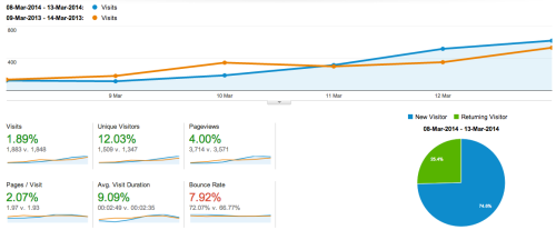
This was the case with us, too. Comparing the analytics for my week as social media editor with those of the previous year, it can be seen that we failed to exploit the possibilities of the weekend to make a strong start, overtaking last year’s visits only at the end of the week. (Note: click the image to see a larger version.)

Islington Now analytics

3) interactive articles are interesting

Good news for those on my course is that, of the top five most visited articles over the past fortnight, four involved interactive / multimedia elements. This includes the twerking article, which used multiple GIFs, and my own data-based comparison of the Wenger and Ferguson eras of football management.

4) Check the limits of free technology

With the proliferation of free Internet tools, it is easy to slip into the attitude of using them without checking their limits.

One of my ideas for an article in the Going out in Islington series – an article on the best ways to get home from a night out – was to provide an interactive map outlining all the bus routes that go through Islington at night and their stops. I eagerly started plotting the six routes on Google Custom Maps but, after an afternoon’s work, I was confronted by the following message:

Google Custom Maps upgrade prompt

Disappointingly, I had to abandon the project, but I learnt a valuable lesson in the process. Click here to see my sadly incomplete map.

So, there are my 4 thoughts, an idea inspired by Joe Hall at Valley Talk Blog. If you have any comments or suggestions, please let me know in the box at the bottom of the page.

Below is a list of articles in the Going out in Islington series:

Below is a list of other articles I wrote for Islington Now:

Social media editorship at Islington Now

Over the course of this week, I’ll be social media editor at Islington Now, the news organization periodically run by students at City University.

In addition to the normal functions of a social media editor, which include publicising stories after they’ve been posted and sourcing material for stories from social media, I’ve come up with a project for the week: a series of articles called “Going out in Islington”.

Stock Content

The main thinking behind this was to create a good base of stock content for the site.

Stock content is that which is useful for weeks and even years after the usual news cycle. It is one of the multitude of innovations that writing for the web involves, in comparison to writing for print, when a newspaper would usually be thrown away a day or two after publication. An example of stock content is an explanatory article, such as the Interhacktives article on how to perform a reverse image search.

It creates a consistent stream of traffic to a site, in contrast to the sporadic peaks and troughs of traffic that accompany its opposite: flow content.

Community engagement

Another important part of the rationale was the desire to engage the Islington Now community.

Once the first article has been posted, people will be better able to comprehend the concept of the series, meaning they’ll be more likely to respond to attempts by us to use social media to crowd-source content. For instance, one of the articles we’ll be doing will be along the lines of “most hipster bars in Islington” and, by both publicising articles and requesting help for future articles, we’re hoping that we can inspire some strong engagement.

Follow-up content

I’ll also be attempting to follow up on content, where possible. For instance, to supplement the article on the best ways to get home, I’m planning to post a link to a map showing all of the night bus routes in and out of Islington. As far as I’m aware, such an Islington-specific map doesn’t currently exist anywhere on the Internet.

Look out for the posts on Twitter and Facebook throughout this week.

Data map: London has England and Wales’ top five multicultural areas

With much hyperbole surrounding the national debate about immigration and Britain’s increasingly multicultural society, it is useful to inject some facts into the discussion.

And, as you might expect, London dominates when it comes to England and Wales’ most multicultural areas.

Location White residents
Newham 29%
Brent 36%
Harrow 42%
Redbridge 43%
Tower Hamlets 45%
Slough 46%
Ealing 49%
Leicester 51%
Hounslow 51%
Waltham Forest 52%

Top of the table is Newham, only 29% of whose residents are white. This compares with the Isles of Scilly at the other end, where a whopping 99% of residents are white.

As the map below shows, the areas where the proportion of white residents is at its lowest are, without exception, urban areas.

White residents map

Click the map to be taken to an interactive version.

Disclaimer: unfortunately, the geocodes for St. Albans were unavailable in the dataset I downloaded from the Office for National Statistics. I assure you, however, that its figure was unexceptional: 88% of its residents are white.

Are you surprised by this result? Is there any way I could have improved this story? Please let me know in the comments section below.

Curation: how the F.A. Cup quarter-final draw happened

After four months on the City course, I thought it was about time I got around to doing some curation.

I chose a recent news event – Sunday’s F.A. Cup quarter-final draw – which a quick search revealed had not yet been curated into a single collection of tweets.

Official accounts promoted their clubs in the build-up:

Then the F.A.’s account added an otherwise missed detail to the discussion:

As there were only four ties to be drawn, proceedings were over quickly (Arsenal-Liverpool was yet to kick off and Sheffield United-Nottingham Forest was yet to finish):

There was some amusing reaction to the Manchester City-Wigan tie, which will be a rematch of last year’s final:

Brighton fans were excited at the prospect of welcoming Sunderland and ex-manager Gus Poyet back to the Amex:

Sheffield United soon beat Nottingham Forest to seal a place in the quarter-finals, and a possible Steel City derby against Sheffield Wednesday:

The result left Nottingham Forest fans disappointed:

Arsenal and Liverpool then played their fifth-round match for the opportunity to face Everton…

…which Arsenal won:

Roberto Martinez, the Everton manager, was immediately on hand to give his reaction:

But, as ever, Boring James Milner had the final say:

Data analysis: The relationship between English language proficiency and economic performance

Looking on the ONS website today, I found a plethora of data – drawn from the 2011 Census – on the relationship between proficiency with the English language and various aspects of economic performance.

I chose, using Tableizer, to focus on the data that looked at the difference between linguistic ability and economic activity. The headline figure is unsurprising: those with a poor level of English are, in general, less likely to be economically active (only 47% of those in this category were economically active, compared with the overall figure of 63%*).

Linguistic ability Total Economically active %
All 45,496,780 28,818,355 63%
Native 41,820,374 26,455,028 63%
Good English 2,891,769 1,996,782 69%
Poor English 784,637 366,545 47%

Jargon buster: It is important to point out that ‘economically active’ does not mean simply ‘in employment’; it means either ‘in work’ or ‘looking for work’ – so it excludes, for example, stay-at-home parents and pensioners.

So, why could this be? (It couldn’t be because most poor English speakers are children, because this data set is for residents of England and Wales over the age of 16.)

Thankfully, the ONS provides a breakdown of the data, so we can look at what is making those with poor English ability economically inactive.

Ability Total Retired Student Looking after family Sick / disabled
All 45,496,780 9,713,808 2,397,348 1,796,520 1,783,292
Native 41,820,374 9,422,213 2,021,824 1,462,558 1,658,503
Good English 2,891,769 165,346 342,153 210,531 63,323
Poor English 784,637 126,249 33,371 123,431 61,466

Translated into percentages:

Ability Total Retired Student Looking after family Sick / disabled
All 45,496,780 21% 5% 4% 4%
Native 41,820,374 23% 5% 3% 4%
Good English 2,891,769 6% 12% 7% 2%
Poor English 784,637 16% 4% 16% 8%

(This isn’t quite the full total of economically inactive people – there was also a column for ‘Other’, but it’s quite difficult to analyse such a vague grouping.)

The table shows that the main differences between those with poor English ability and the average is that, proportionally, many more of them – four times the average (16% versus 4%) – are engaged in looking after family, and twice the average (8% versus 4%) are sick / disabled.

There are many potential reasons for this, such as that those with poor English ability might come from more traditional or religious backgrounds, in which it is rare for both parents to work. So it is instructive to note that, although far fewer people with poor English ability are economically active than the average, there might be good reasons for this – and we ought not to be distracted by the headline figure.

There are other points of interest in this data set – such as why those with good English ability are more economically active than native speakers (69% versus 63%) – but I’ll save those for another time.

*Note: The terms in the tables are not official ONS terms; I translated them to cut through the jargon.

The data used here refer to residents of England and Wales over the age of 16, and can be found here.